
paper magazine
magazine design
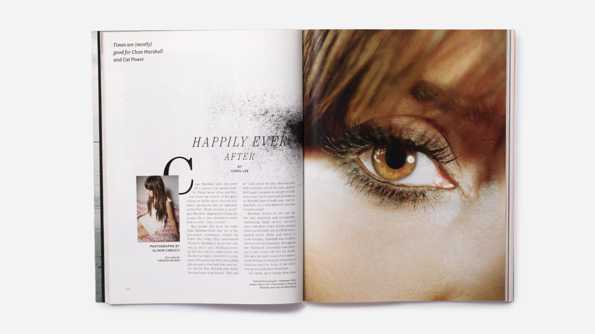
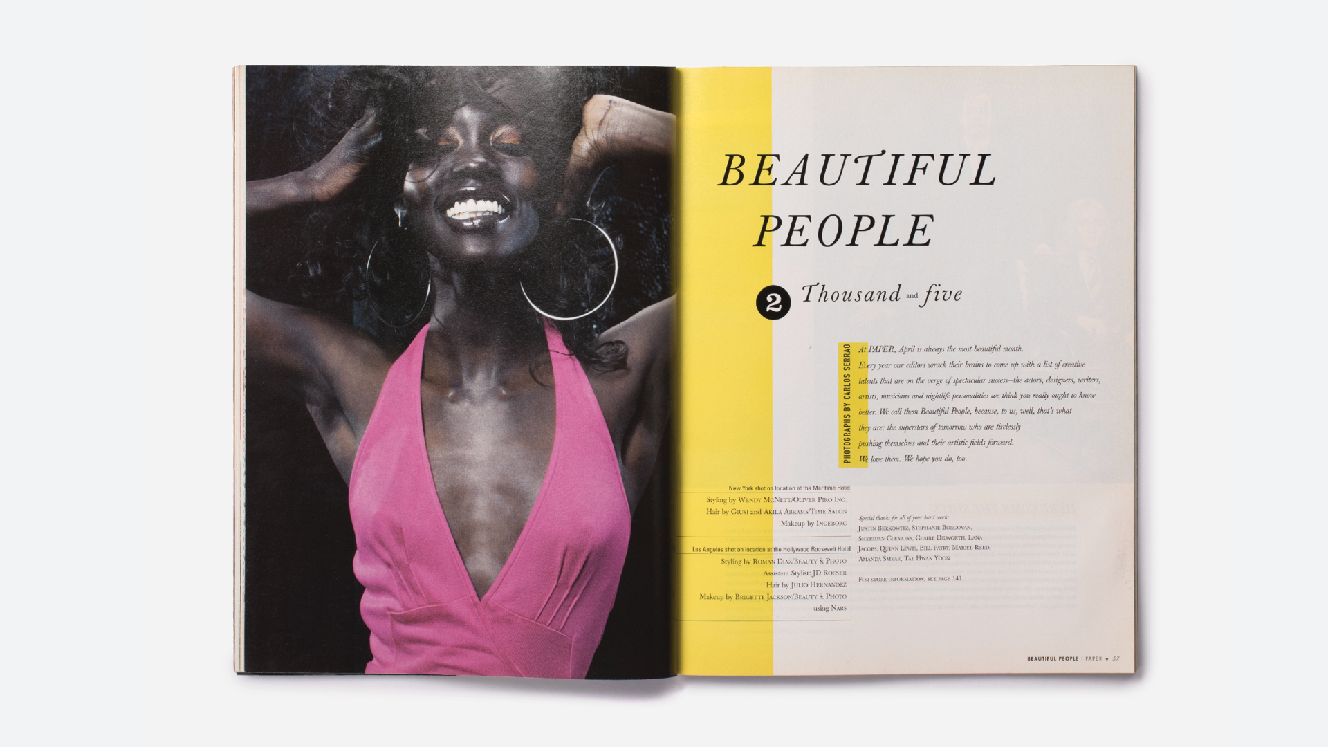
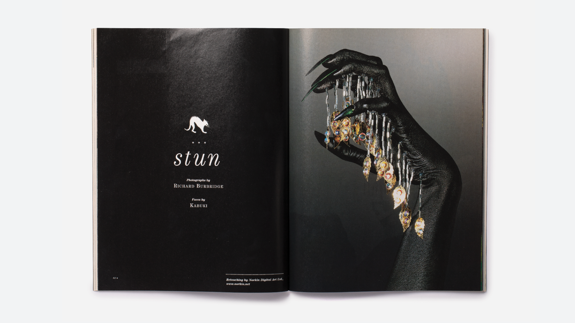
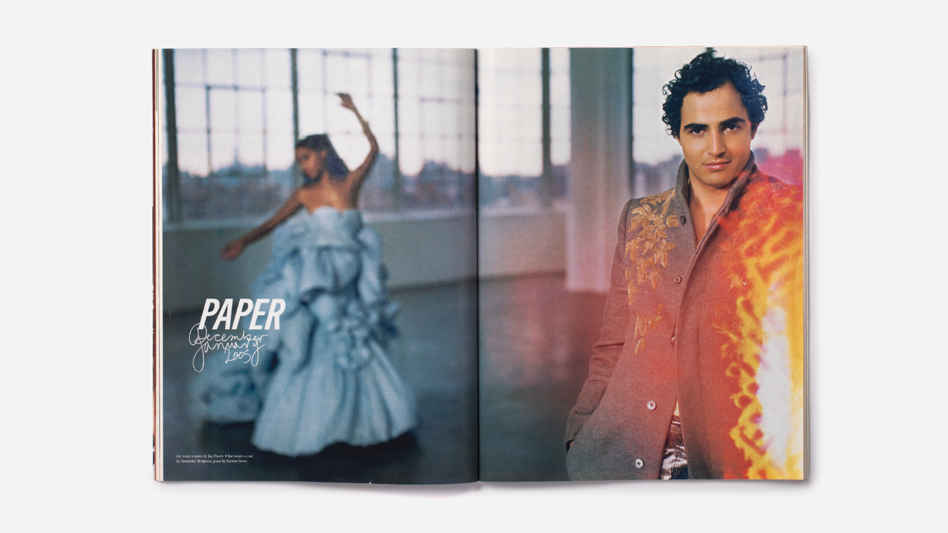
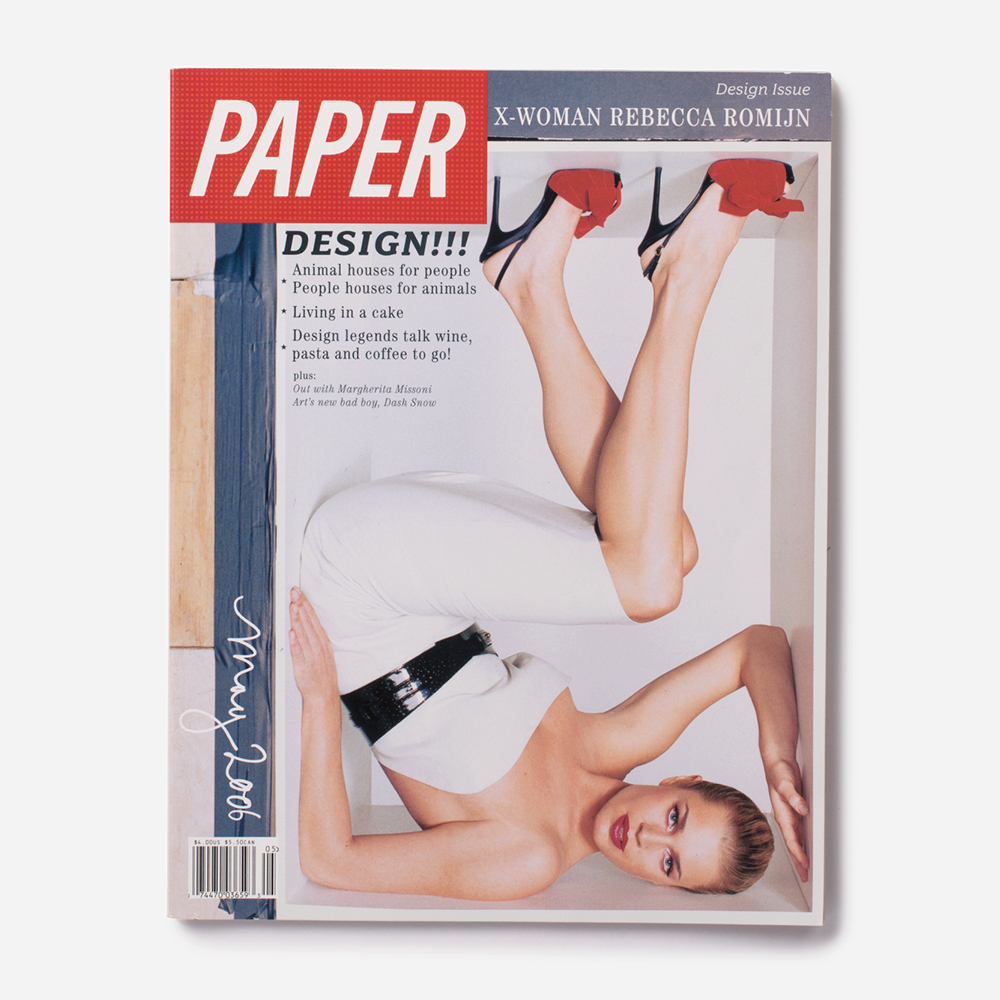
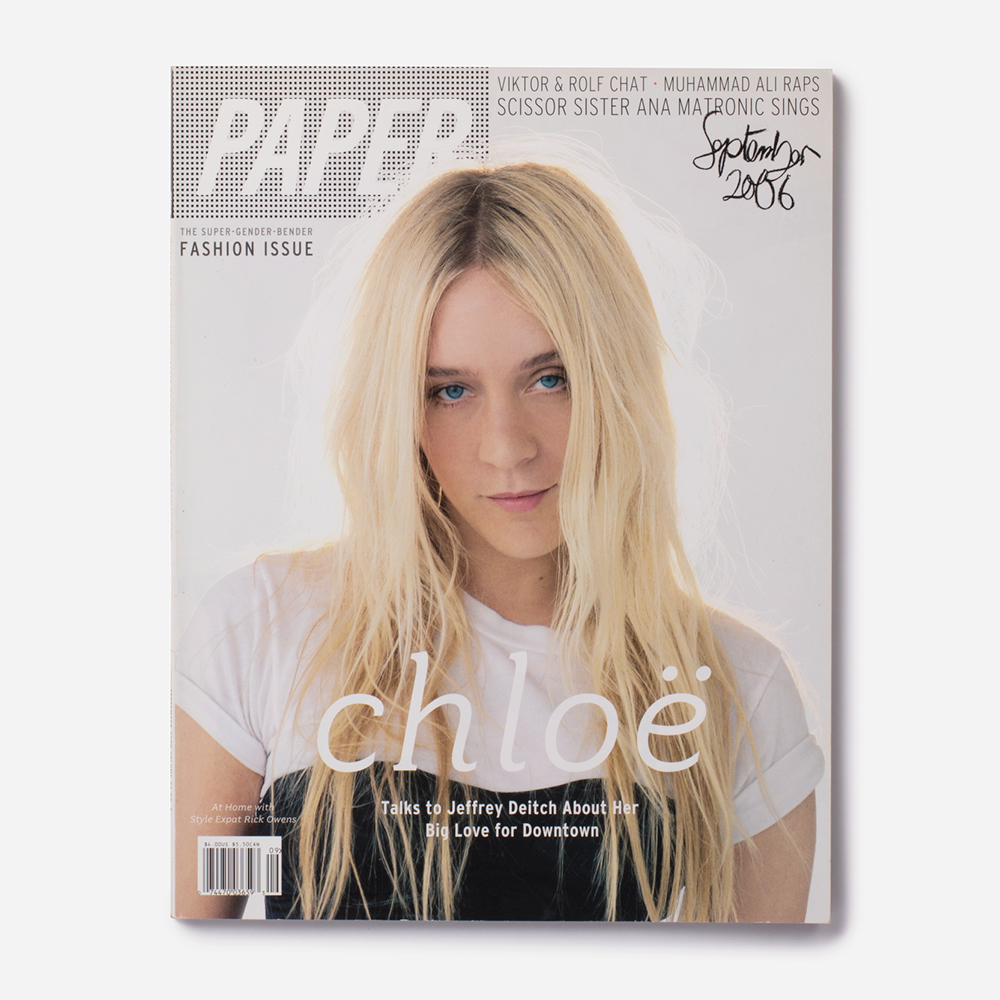
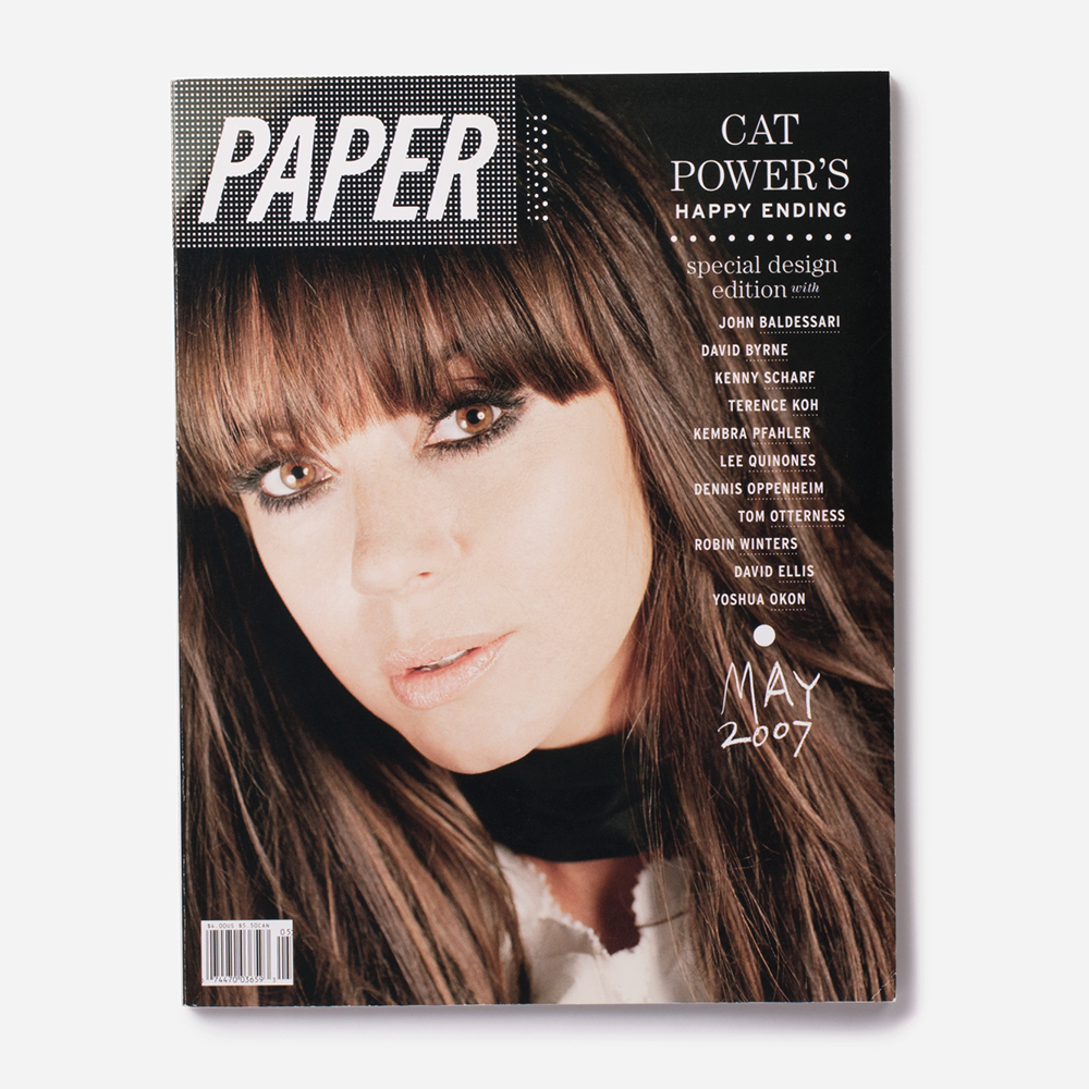
I re-designed Paper magazine, from top to bottom, bringing in new content, departments, and a slew of new contributors. The first task was to standardize the masthead and after months of research and experiments we decided a custom, italic version of Trade Gothic condensed was right: it’s utilitarian and simple, and the forward gesture of the italic gave it a zing, reminiscent of some sort of trashy but intoxicating European tabloid. I wanted visual depth to the logo, and the flexibility to change it every month, so instead of the canned, photoshop transparencies that most magazines were using at the time, I decided to go back to basics, using a dot pattern. The dot pattern was a nod to the mass production process of magazine printing, and like a woven fabric it allowed us to create infinite configurations.
The Paper covers
Click on any image to enlarge


CLIENT: Paper Magazine
PROJECT: magazine and brand design
DATES: 2004-2008
CREDITS: Peter Buchanan-Smith (design direction, design); Jillian Parisi, Lindsay Ballant (design).